Alignment of paragraphs and headings in CSS
user5447339
I have a design below which I am trying to replicate in HTML and CSS:
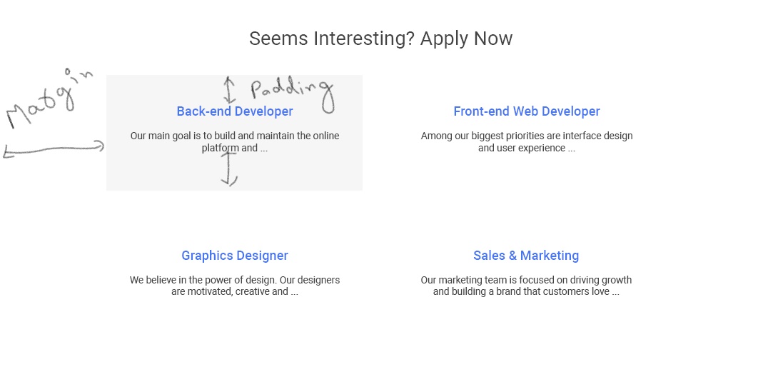
Note: I have written text Margin and Padding to make things easy to understand. It will not come in the actual design
At this moment, I am able to get this in my fiddle.
The only thing which is not matching the above design in the fiddle are the paragraphs (eg: Our main goal, Among our biggest, etc) in every box which don't have line break. I am considering boxes as every job-opening with titles (Back-end .., Front-end .., etc) and paragraphs (eg: Our main goal, Among our biggest, etc).
The CSS for every box is:
.firstrow {
    display: inline-block;
    width: 100%;
}


.firstrow #front-end {
    text-align: center;
    width: 50%;
    height: 250px;
    float: left;
    background-repeat: no-repeat;
    display: flex;
    align-items: center;
    background-size: 100% 100%;
    justify-content: center;
}
dippas
Here is a improved version of your code, just using flexbox, without using floats or anything else.
h2 {
  text-align: center;
  font-size: 2.8rem;
  color: #444444;
}

.row {
  display: flex;
  flex-wrap: wrap;
  padding: 5%;
}

.row>div {
  padding: 5%;
  background: gray;
  margin: 15px;
  display: flex;
  flex-flow: column wrap;
  align-items: center;
  justify-content: center;
  text-align: center;
  flex: 1;
  box-sizing:border-box
}
<div class="job-openings">
<h2>Seems Interesting? Apply Now</h2>
<div class="row">
<div id="back-end">
<h3>Back-end Developer</h3>
<p> Our main goal is to build and maintain the online platform and...</p>
</div>
<div id="front-end">
<h3>Front-end Web Developer</h3>
<p>Among our biggest priorities are interface design and user experience...</p>
</div>
<div id="graphics">
<h3>Graphics Designer</h3>
<p> We believe in the power of design. Our designers are motivated, creative and...</p>
</div>
<div id="sales">
<h3>Sales & Marketing</h3>
<p>Our Marketing team is focussed on driving growth and building a brand that customers love...</p>
</div>
</div>
</div>Op's Comment to answer:
Back-end and front-end will come in one row with graphics designer and sales and marketing in another row.
Assuming you want to have always 2 rows, then you can use flex:0 50% instead of flex:1, in this case flex: 0 calc(50% - 30px) to take in count the margin
h2 {
  text-align: center;
  font-size: 2.8rem;
  color: #444444;
}

.row {
  display: flex;
  flex-wrap: wrap;
  padding: 5%;
}

.row>div {
  padding: 5%;
  background: gray;
  margin: 15px;
  display: flex;
  flex-flow: column wrap;
  align-items: center;
  justify-content: center;
  text-align: center;
  flex: 0 calc(50% - 30px);
  box-sizing:border-box
}
<div class="job-openings">
<h2>Seems Interesting? Apply Now</h2>
<div class="row">
<div id="back-end">
<h3>Back-end Developer</h3>
<p> Our main goal is to build and maintain the online platform and...</p>
</div>
<div id="front-end">
<h3>Front-end Web Developer</h3>
<p>Among our biggest priorities are interface design and user experience...</p>
</div>
<div id="graphics">
<h3>Graphics Designer</h3>
<p> We believe in the power of design. Our designers are motivated, creative and...</p>
</div>
<div id="sales">
<h3>Sales & Marketing</h3>
<p>Our Marketing team is focussed on driving growth and building a brand that customers love...</p>
</div>
</div>
</div>Collected from the Internet
Please contact [email protected] to delete if infringement.
edited at
- Prev: Fatal Exception thrown on Scheduler - rxJava2 in Android
- Next: How to get MQ CLI commands to run against a single MQ installation?
Related
TOP Ranking
- 1
Loopback Error: connect ECONNREFUSED 127.0.0.1:3306 (MAMP)
- 2
Can't pre-populate phone number and message body in SMS link on iPhones when SMS app is not running in the background
- 3
pump.io port in URL
- 4
How to import an asset in swift using Bundle.main.path() in a react-native native module
- 5
Failed to listen on localhost:8000 (reason: Cannot assign requested address)
- 6
Spring Boot JPA PostgreSQL Web App - Internal Authentication Error
- 7
Emulator wrong screen resolution in Android Studio 1.3
- 8
3D Touch Peek Swipe Like Mail
- 9
Double spacing in rmarkdown pdf
- 10
Svchost high CPU from Microsoft.BingWeather app errors
- 11
How to how increase/decrease compared to adjacent cell
- 12
Using Response.Redirect with Friendly URLS in ASP.NET
- 13
java.lang.NullPointerException: Cannot read the array length because "<local3>" is null
- 14
BigQuery - concatenate ignoring NULL
- 15
How to fix "pickle_module.load(f, **pickle_load_args) _pickle.UnpicklingError: invalid load key, '<'" using YOLOv3?
- 16
ngClass error (Can't bind ngClass since it isn't a known property of div) in Angular 11.0.3
- 17
Can a 32-bit antivirus program protect you from 64-bit threats
- 18
Make a B+ Tree concurrent thread safe
- 19
Bootstrap 5 Static Modal Still Closes when I Click Outside
- 20
Vector input in shiny R and then use it
- 21
Assembly definition can't resolve namespaces from external packages
Comments