Toggle button collapse not working in Bootstrap navbar
James Howley
My toggle button is not working when the navbar collapses. I have checked the data-target several times and looks ok.
Here is my code:
<div class="navbar navbar-fixed-top navbar-inverse">
 <div class="container">
  <button type="button" class="navbar-toggle" data-toggle="collapse" data-target=".navbar-collapse">
    <span class="icon-bar"></span>
    <span class="icon-bar"></span>
    <span class="icon-bar"></span>
  </button>
  <a class="navbar-brand" href="index.html" title="The Title">
    <img style="max-width:100px;" src="images/LOGO-4.png">
  </a>


    <div class="collapse navbar-collapse navbar-collapse">
        <ul class="nav navbar-nav pull-right">
            <li class="active"><a href="#">WORK</a></li>
            <li><a href="#">CONTACT</a></li>

        </ul>
    </div>
Does anybody know what the problem is and how I can fix it?
Prasanth Louis
Of course your toggle button will differ based on your screen resolution. Try something along the lines of:
    <html>
    <head>
        <meta name="viewport" content="width=device-width, initial-scale=1">

<link rel="stylesheet" href="http://maxcdn.bootstrapcdn.com/bootstrap/3.2.0/css/bootstrap.min.css">


     </head>
<body >

<nav class="navbar navbar-inverse">
<div class="container-fluid">

 <div class="navbar-header">
  <button type="button" class="navbar-toggle" data-toggle="collapse" data-target="#myNavbar">
    <span class="icon-bar"></span>
    <span class="icon-bar"></span>
    <span class="icon-bar"></span>
  </button>
  <a class="navbar-brand" href="index.html" title="The Title">
    <img style="max-width:100px;" src="images/LOGO-4.png">
  </a>
</div>

    <div class="collapse navbar-collapse navbar-collapse" id="myNavbar">
        <ul class="nav navbar-nav pull-right">
            <li class="active"><a href="#">WORK</a></li>
            <li><a href="#">CONTACT</a></li>

        </ul>
    </div>
    </div>
    </nav>
     <script src="https://ajax.googleapis.com/ajax/libs/jquery/1.11.1/jquery.min.js"></script>
    <script src="http://maxcdn.bootstrapcdn.com/bootstrap/3.2.0/js/bootstrap.min.js"></script>

    </body>
</html>
Try this out on your mobile and see. Afterwards go into your css file and set the properties for screen size on WHEN should the toggle button appear to be. The toggle button might not appear on the desktop until you change these properties, or resize your browser window smaller, and smaller until the toggle button appears.
Eg. Maximized on my browser window, the toggle button doesn't appear. 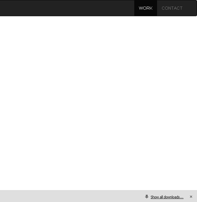 However if you resize your browser window by half(or if you're surfing on a phone), it'll look like this
To fix this you'll need to go into your css settings. But this is ONLY if you want to change it. Otherwise it'll work fine.
Collected from the Internet
Please contact [email protected] to delete if infringement.
edited at
- Prev: Bootstrap carousel-fade no longer working with maxcdn 3.3.bootstrap.min.css
- Next: How to use DbContext without using Edmx in C#?
Related
TOP Ranking
- 1
pump.io port in URL
- 2
How to import an asset in swift using Bundle.main.path() in a react-native native module
- 3
Failed to listen on localhost:8000 (reason: Cannot assign requested address)
- 4
Double spacing in rmarkdown pdf
- 5
SQL Server : need add a dot before two last character
- 6
Ambiguous use of 'init' with CFStringTransform and Swift 3
- 7
Resetting Value of <input type="time"> in Firefox
- 8
Retrieve Element Tag Value XML Using Bash
- 9
How to pass data to the ng2-bs3-modal?
- 10
JWT gives JsonWebTokenError "invalid token"
- 11
How to update azerothcore-wotlk docker container
- 12
C++ 16 bit grayscale gradient image from 2D array
- 13
redirect your computer port to url
- 14
Capybara Selenium Chrome opens About Google Chrome
- 15
mysql.connector.errors.InterfaceError: 2003: Can't connect to MySQL server on '127.0.0.1:3306' (111 Connection refused)
- 16
How to make thrown errors visible outside of a Promise?
- 17
JMeter: Why get error when try to save test plan
- 18
Should you provide dependent libraries in client jar?
- 19
Issue making model pop up onPress of flatlist
- 20
Message: element not interactable on accessing a tag python
- 21
Calling Doctrine clear() with an argument is deprecated
Comments