Padding-bottom/top in flexbox layout
Simon_Weaver :
I have a flexbox layout containing two items. One of them uses padding-bottom :
#flexBox {
  border: 1px solid red;
  width: 50%;
  margin: 0 auto;
  padding: 1em;
  display: flex;
  flex-direction: column;
}
#text {
  border: 1px solid green;
  padding: .5em;
}
#padding {
  margin: 1em 0;
  border: 1px solid blue;
  padding-bottom: 56.25%; /* intrinsic aspect ratio */
  height: 0;
}
<div id='flexBox'>
<div id='padding'></div>
<div id='text'>Some text</div>
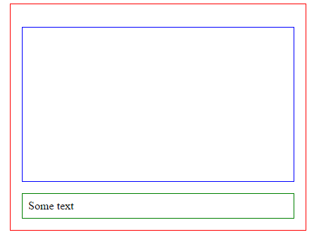
</div>The blue element maintains its aspect ratio according to its width when the page is resized. This works with Chrome and IE and looks like :
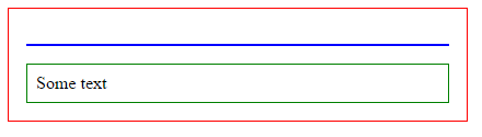
However, in Firefox and Edge, I get the following (it's ignoring the padding on the blue box, which is what maintains the aspect ratio):
I'm too new to flexbox to really understand if this should or shouldn't work. The whole point of flexbox is to resize things, but I'm not sure why it is ignoring the intrinsic padding, and putting absolute sizes on the blue element.
I guess ultimately I'm not even sure if Firefox or Chrome is doing the correct thing! Can any Firefox flexbox experts help?
web-tiki :
Update september 2020
FireFox and edge have implemented the behaviour from the specs and margin + padding for flex elements are both calculated occording to the width of the containing block.
Just like block elements.
Update Febuary 2018
Firefox and edge have agreed to change their behaviour on top, bottom margin and padding for flex (and grid) items :
[...] e.g. left/right/top/bottom percentages all resolve against their containing block’s width in horizontal writing modes. [source]
This is not yet implemented (tested on FF 58.0.2).
Update april 2016
The specs have been updated to:
Percentage margins and paddings on flex items can be resolved against either:
- their own axis (left/right percentages resolve against width, top/bottom resolve against height), or,
- the inline axis (left/right/top/bottom percentages all resolve against width)
source: CSS Flexible Box Layout Module Level 1
This means that chrome IE FF and Edge (even if they don't have the same behaviour) follow the specs recomendation.
Specs also say:
Authors should avoid using percentages in paddings or margins on flex items entirely, as they will get different behavior in different browsers. [source]
Work around :
You can wrap the first child of the flex container in an other element and put the padding-bottom on the second child :
#flexBox {
  border: 1px solid red;
  width: 50%;
  margin: 0 auto;
  padding: 1em;
  display: flex;
  flex-direction: column;
}
#text {
  border: 1px solid green;
  padding: .5em;
}
#padding {
  margin: 1em 0;
  border: 1px solid blue;
}
#padding > div {
  padding-bottom: 56.25%; /* intrinsic aspect ratio */
}
<div id='flexBox'>
<div id='padding'><div></div></div>
<div id='text'>Some text</div>
</div>I tested this in modern browsers (IE, chrome, FF and Edge) and they all have the same behaviour. As the configuration of the 2nd child is the "same as usual", I suppose that older browsers (that aslo support flexbox layout module) will render the same layout.
Previous answer:
According to the specs, Firefox has the right behaviour
Explanantion :
Unlike block items which calculate their % margin/padding according to the containers width, on flex items:
Percentage margins and paddings on flex items are always resolved against their respective dimensions; unlike blocks, they do not always resolve against the inline dimension of their containing block.
This means that padding-bottom/top and margin-bottom/top are calculated according to the height of the container and not the width like in non-flexbox layouts.
As you have not specified any height on the parent flex item, the bottom padding of the child is supposed to be 0px.
Here is a fiddle with a fixed height on the parent that shows that padding bottom is calculated according to the height of the display:flex; container.
Collected from the Internet
Please contact [email protected] to delete if infringement.
edited at
- Prev: How to get the build variant at runtime in Android Studio?
- Next: How to search images from private 1.0 registry in docker?
Related
TOP Ranking
- 1
pump.io port in URL
- 2
How to import an asset in swift using Bundle.main.path() in a react-native native module
- 3
Failed to listen on localhost:8000 (reason: Cannot assign requested address)
- 4
Inner Loop design for webscrapping
- 5
Can't pre-populate phone number and message body in SMS link on iPhones when SMS app is not running in the background
- 6
mysql.connector.errors.InterfaceError: 2003: Can't connect to MySQL server on '127.0.0.1:3306' (111 Connection refused)
- 7
Removed zsh, but forgot to change shell back to bash, and now Ubuntu crashes (wsl)
- 8
ggplotly no applicable method for 'plotly_build' applied to an object of class "NULL" if statements
- 9
How to run blender on webserver?
- 10
Resetting Value of <input type="time"> in Firefox
- 11
Converting a class method to a property with a backing field
- 12
Ambiguous use of 'init' with CFStringTransform and Swift 3
- 13
Execute ./script.sh with a crontab
- 14
How to set tab order for array of cluster,where cluster elements have different data types in LabVIEW?
- 15
How to pass data to the ng2-bs3-modal?
- 16
Retrieve Element Tag Value XML Using Bash
- 17
Spring Boot JPA PostgreSQL Web App - Internal Authentication Error
- 18
SQL Server : need add a dot before two last character
- 19
Making Array From Page Elements in jQuery
- 20
Laravel's ORM sync with timestamps doesn't update timestamps
- 21
Do animations stop css changes after animation completion?
Comments