How to combine Background Image + Linear Gradient in CSS ? Linear Gradient over the Background Image
Clay
wish you all are doing well.
So I have a section with a background image and I want to add a linear gradient over the background image.
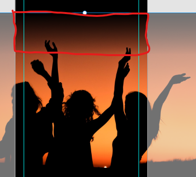
The result I aim for:
Till now, I have a div with a background image.
Curent CSS:
background-image: url("../pixels/lastCallToActionBg.jpg");
background-position: center;
background-repeat: no-repeat;
background-size: cover;
Linear Gradiant CSS that I want to add:
background: url(data:image/svg+xml;base64,PD94bWwgdmVyc2lvbj0iMS4wIiA/Pgo8c3ZnIHhtbG5zPSJodHRwOi8vd3d3LnczLm9yZy8yMDAwL3N2ZyIgd2lkdGg9IjEwMCUiIGhlaWdodD0iMTAwJSIgdmlld0JveD0iMCAwIDEgMSIgcHJlc2VydmVBc3BlY3RSYXRpbz0ibm9uZSI+CiAgPGxpbmVhckdyYWRpZW50IGlkPSJncmFkLXVjZ2ctZ2VuZXJhdGVkIiBncmFkaWVudFVuaXRzPSJ1c2VyU3BhY2VPblVzZSIgeDE9IjAlIiB5MT0iMCUiIHgyPSIwJSIgeTI9IjEwMCUiPgogICAgPHN0b3Agb2Zmc2V0PSIwJSIgc3RvcC1jb2xvcj0iIzAwMDAwMCIgc3RvcC1vcGFjaXR5PSIxIi8+CiAgICA8c3RvcCBvZmZzZXQ9IjElIiBzdG9wLWNvbG9yPSIjMDAwMDAwIiBzdG9wLW9wYWNpdHk9IjEiLz4KICAgIDxzdG9wIG9mZnNldD0iMTUlIiBzdG9wLWNvbG9yPSIjMDAwMDAwIiBzdG9wLW9wYWNpdHk9IjAiLz4KICAgIDxzdG9wIG9mZnNldD0iMTAwJSIgc3RvcC1jb2xvcj0iIzAwMDAwMCIgc3RvcC1vcGFjaXR5PSIwIi8+CiAgPC9saW5lYXJHcmFkaWVudD4KICA8cmVjdCB4PSIwIiB5PSIwIiB3aWR0aD0iMSIgaGVpZ2h0PSIxIiBmaWxsPSJ1cmwoI2dyYWQtdWNnZy1nZW5lcmF0ZWQpIiAvPgo8L3N2Zz4=);
background: -moz-linear-gradient(
  top,
  rgba(0, 0, 0, 1) 0%,
  rgba(0, 0, 0, 1) 1%,
  rgba(0, 0, 0, 0) 15%,
  rgba(0, 0, 0, 0) 100%
); /* FF3.6-15 */
background: -webkit-gradient(
  linear,
  left top,
  left bottom,
  color-stop(0%, rgba(0, 0, 0, 1)),
  color-stop(1%, rgba(0, 0, 0, 1)),
  color-stop(15%, rgba(0, 0, 0, 0)),
  color-stop(100%, rgba(0, 0, 0, 0))
); /* Chrome4-9,Safari4-5 */
background: -webkit-linear-gradient(
  top,
  rgba(0, 0, 0, 1) 0%,
  rgba(0, 0, 0, 1) 1%,
  rgba(0, 0, 0, 0) 15%,
  rgba(0, 0, 0, 0) 100%
); /* Chrome10-25,Safari5.1-6 */
background: -o-linear-gradient(
  top,
  rgba(0, 0, 0, 1) 0%,
  rgba(0, 0, 0, 1) 1%,
  rgba(0, 0, 0, 0) 15%,
  rgba(0, 0, 0, 0) 100%
); /* Opera 11.10-11.50 */ /* IE10 preview */
background: -webkit-gradient(
  linear,
  left top,
  left bottom,
  from(rgba(0, 0, 0, 1)),
  color-stop(1%, rgba(0, 0, 0, 1)),
  color-stop(15%, rgba(0, 0, 0, 0)),
  to(rgba(0, 0, 0, 0))
);
background: -moz-linear-gradient(
  top,
  rgba(0, 0, 0, 1) 0%,
  rgba(0, 0, 0, 1) 1%,
  rgba(0, 0, 0, 0) 15%,
  rgba(0, 0, 0, 0) 100%
);
background: linear-gradient(
  to bottom,
  rgba(0, 0, 0, 1) 0%,
  rgba(0, 0, 0, 1) 1%,
  rgba(0, 0, 0, 0) 15%,
  rgba(0, 0, 0, 0) 100%
); /* W3C, IE10+, FF16+, Chrome26+, Opera12+, Safari7+ */
filter: progid:DXImageTransform.Microsoft.gradient( startColorstr='#000000', endColorstr='#00000000',GradientType=0 ); /* IE6-8 */
Thank you.
Vlastimil Lisák
Make a div inside the section, it will serve as a mask, and set the gradient of this mask as a background in it.
The css of the mask will look like this:
position: relative;
top: 0;
left: 0;
width: 100%;
height: 100%;
So it would be all over the parent element (section)
section {

    width: 100vw;
    height: 10rem;
    background: url(https://www.yannickdixon.com/wp-content/uploads/2016/12/161124-golden-seaside-sunset-photography-print.jpg);
}

.overlay {

position: relative;
    top: 0;
    left: 0;
    width: 100%;
    height: 100%;
    background: url(data:image/svg+xml;base64,PD94bWwgdmVyc2lvbj0iMS4wIiA/Pgo8c3ZnIHhtbG5zPSJodHRwOi8vd3d3LnczLm9yZy8yMDAwL3N2ZyIgd2lkdGg9IjEwMCUiIGhlaWdodD0iMTAwJSIgdmlld0JveD0iMCAwIDEgMSIgcHJlc2VydmVBc3BlY3RSYXRpbz0ibm9uZSI+CiAgPGxpbmVhckdyYWRpZW50IGlkPSJncmFkLXVjZ2ctZ2VuZXJhdGVkIiBncmFkaWVudFVuaXRzPSJ1c2VyU3BhY2VPblVzZSIgeDE9IjAlIiB5MT0iMCUiIHgyPSIwJSIgeTI9IjEwMCUiPgogICAgPHN0b3Agb2Zmc2V0PSIwJSIgc3RvcC1jb2xvcj0iIzAwMDAwMCIgc3RvcC1vcGFjaXR5PSIxIi8+CiAgICA8c3RvcCBvZmZzZXQ9IjElIiBzdG9wLWNvbG9yPSIjMDAwMDAwIiBzdG9wLW9wYWNpdHk9IjEiLz4KICAgIDxzdG9wIG9mZnNldD0iMTUlIiBzdG9wLWNvbG9yPSIjMDAwMDAwIiBzdG9wLW9wYWNpdHk9IjAiLz4KICAgIDxzdG9wIG9mZnNldD0iMTAwJSIgc3RvcC1jb2xvcj0iIzAwMDAwMCIgc3RvcC1vcGFjaXR5PSIwIi8+CiAgPC9saW5lYXJHcmFkaWVudD4KICA8cmVjdCB4PSIwIiB5PSIwIiB3aWR0aD0iMSIgaGVpZ2h0PSIxIiBmaWxsPSJ1cmwoI2dyYWQtdWNnZy1nZW5lcmF0ZWQpIiAvPgo8L3N2Zz4=);
    background: -moz-linear-gradient( top, rgba(0, 0, 0, 1) 0%, rgba(0, 0, 0, 1) 1%, rgba(0, 0, 0, 0) 15%, rgba(0, 0, 0, 0) 100% );
    background: -webkit-gradient( linear, left top, left bottom, color-stop(0%, rgba(0, 0, 0, 1)), color-stop(1%, rgba(0, 0, 0, 1)), color-stop(15%, rgba(0, 0, 0, 0)), color-stop(100%, rgba(0, 0, 0, 0)) );
    background: -webkit-linear-gradient( top, rgba(0, 0, 0, 1) 0%, rgba(0, 0, 0, 1) 1%, rgba(0, 0, 0, 0) 15%, rgba(0, 0, 0, 0) 100% );
    background: -o-linear-gradient( top, rgba(0, 0, 0, 1) 0%, rgba(0, 0, 0, 1) 1%, rgba(0, 0, 0, 0) 15%, rgba(0, 0, 0, 0) 100% );
    background: -webkit-gradient( linear, left top, left bottom, from(rgba(0, 0, 0, 1)), color-stop(1%, rgba(0, 0, 0, 1)), color-stop(15%, rgba(0, 0, 0, 0)), to(rgba(0, 0, 0, 0)) );
    background: -moz-linear-gradient( top, rgba(0, 0, 0, 1) 0%, rgba(0, 0, 0, 1) 1%, rgba(0, 0, 0, 0) 15%, rgba(0, 0, 0, 0) 100% );
    background: linear-gradient( to bottom, rgba(0, 0, 0, 1) 0%, rgba(0, 0, 0, 1) 1%, rgba(0, 0, 0, 0) 15%, rgba(0, 0, 0, 0) 100% );
    filter: progid:DXImageTransform.Microsoft.gradient( startColorstr='#000000', endColorstr='#00000000',GradientType=0 );
}
<section>
<div class="overlay"></div>
</section>Collected from the Internet
Please contact [email protected] to delete if infringement.
edited at
- Prev: Woocommerce WP allimport
- Next: How to generate EF Core migrations script when ConnectionString is only known after ARM template deployment?
Related
TOP Ranking
- 1
Loopback Error: connect ECONNREFUSED 127.0.0.1:3306 (MAMP)
- 2
Can't pre-populate phone number and message body in SMS link on iPhones when SMS app is not running in the background
- 3
pump.io port in URL
- 4
How to import an asset in swift using Bundle.main.path() in a react-native native module
- 5
Failed to listen on localhost:8000 (reason: Cannot assign requested address)
- 6
Spring Boot JPA PostgreSQL Web App - Internal Authentication Error
- 7
Emulator wrong screen resolution in Android Studio 1.3
- 8
3D Touch Peek Swipe Like Mail
- 9
Double spacing in rmarkdown pdf
- 10
Svchost high CPU from Microsoft.BingWeather app errors
- 11
How to how increase/decrease compared to adjacent cell
- 12
Using Response.Redirect with Friendly URLS in ASP.NET
- 13
java.lang.NullPointerException: Cannot read the array length because "<local3>" is null
- 14
BigQuery - concatenate ignoring NULL
- 15
How to fix "pickle_module.load(f, **pickle_load_args) _pickle.UnpicklingError: invalid load key, '<'" using YOLOv3?
- 16
ngClass error (Can't bind ngClass since it isn't a known property of div) in Angular 11.0.3
- 17
Can a 32-bit antivirus program protect you from 64-bit threats
- 18
Make a B+ Tree concurrent thread safe
- 19
Bootstrap 5 Static Modal Still Closes when I Click Outside
- 20
Vector input in shiny R and then use it
- 21
Assembly definition can't resolve namespaces from external packages
Comments