Change size of SVG clipping mask on mouseover
buckdanny
I want to show images using a mask. I tried the css clip-path but because the browser support is that poor I want to use an svg for clipping. My question is how can i change the size of the mask on mousover?
Like here: 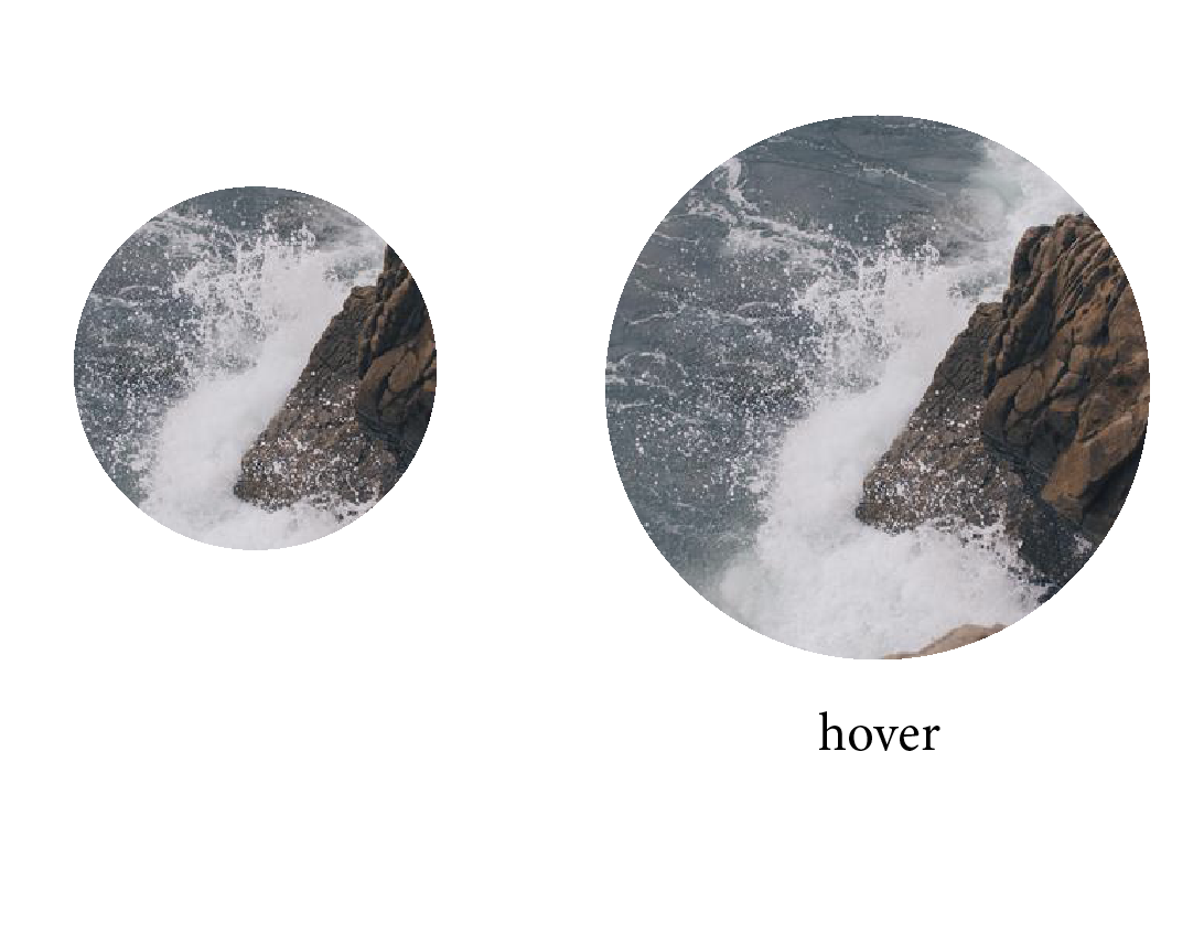
I am using this code at the moment:
 <svg>
	 <defs>
	    <!--defines the shape to use for clipping-->
	    <circle id="circle" cx="100" cy="100" r="100" />
	  </defs>
	  <clipPath id="clip">
	    <!--creates the clipping mask from the shape-->
	    <use xlink:href="#circle" overflow="visible"></use>
	  </clipPath>
	  <!--group containing the image with clipping applied-->
	  <g clip-path="url(#clip)">
	    <image overflow="visible" xlink:href="model_detail.jpg"></image>
	  </g>
</svg
enxaneta
In your case, since you need to resize both the circle and the clipped image, you may scale the svg element on hover like so:
svg {
  display: block;
  position: absolute;
  margin: auto;
  top: 0;
  bottom: 0;
  left: 0;
  right: 0;
  transform: scale(1);
  transition: transform 0.5s;
}
svg:hover {
  transform: scale(1.5);
}
<svg viewBox="0 0 200 200" width="200">
<defs>
<!--defines the shape to use for clipping-->
<circle id="circle" cx="100" cy="100" r="100" />
</defs>
<clipPath id="clip">
<!--creates the clipping mask from the shape-->
<use xlink:href="#circle" overflow="visible"></use>
</clipPath>
<!--group containing the image with clipping applied-->
<g clip-path="url(#clip)">
<image overflow="visible" xlink:href="https://s3-us-west-2.amazonaws.com/s.cdpn.io/222579/darwin300.jpg"></image>
</g>
</svg>Please observe that I've added a viewBox and a width attribute to the svg. If you don't declare the viewBox and the width the svg element will have a size of 300px/150px and the part of the circle that falls outside the svg canvas will be cuted off.
UPDATE
The OP is commenting
I don't want to scale the image, just the mask. Is that possible?
This is how I would do it: In the next example I'm using transitions to scale the circle when you mouse over the svg element:
#c{transform: scale(1);
  transition: transform 0.5s;}

svg:hover #c {
  transform: scale(1.5);
}
Next comes a working example:
svg {
  border: 1px solid;
  display: block;
  position: absolute;
  margin: auto;
  top: 0;
  bottom: 0;
  left: 0;
  right: 0;

}

#c{transform: scale(1);
  transition: transform 0.5s;}

svg:hover #c {
  transform: scale(1.5);
}
<svg viewBox="-150 -150 300 300" width="200">
<defs>
<clipPath id="clip">
<!--creates the clipping mask from the shape-->
<circle id="c" r="100" />
</clipPath>
</defs>
<!--group containing the image with clipping applied-->
<image clip-path="url(#clip)" id="img" xlink:href="https://s3-us-west-2.amazonaws.com/s.cdpn.io/222579/darwin300.jpg" x="-150" y="-150" width="300" height="300"></image>
</svg>Collected from the Internet
Please contact [email protected] to delete if infringement.
edited at
- Prev: Should I have to implement all 4 operator overload in order to deal with all const and non-const combinations?
- Next: Angular, how to include multiple components in a lazy loaded module?
Related
TOP Ranking
- 1
pump.io port in URL
- 2
How to import an asset in swift using Bundle.main.path() in a react-native native module
- 3
Failed to listen on localhost:8000 (reason: Cannot assign requested address)
- 4
Inner Loop design for webscrapping
- 5
Can't pre-populate phone number and message body in SMS link on iPhones when SMS app is not running in the background
- 6
mysql.connector.errors.InterfaceError: 2003: Can't connect to MySQL server on '127.0.0.1:3306' (111 Connection refused)
- 7
Removed zsh, but forgot to change shell back to bash, and now Ubuntu crashes (wsl)
- 8
ggplotly no applicable method for 'plotly_build' applied to an object of class "NULL" if statements
- 9
How to run blender on webserver?
- 10
Resetting Value of <input type="time"> in Firefox
- 11
Converting a class method to a property with a backing field
- 12
Ambiguous use of 'init' with CFStringTransform and Swift 3
- 13
Execute ./script.sh with a crontab
- 14
How to set tab order for array of cluster,where cluster elements have different data types in LabVIEW?
- 15
How to pass data to the ng2-bs3-modal?
- 16
Retrieve Element Tag Value XML Using Bash
- 17
Spring Boot JPA PostgreSQL Web App - Internal Authentication Error
- 18
SQL Server : need add a dot before two last character
- 19
Making Array From Page Elements in jQuery
- 20
Laravel's ORM sync with timestamps doesn't update timestamps
- 21
Do animations stop css changes after animation completion?
Comments