How to display one item on top of other items by using Flexbox?
Nima
By using Flexbox, I want to center three elements inside a photo and then put one element on top of those three:
I tried this to center them and obviously all the items get centered, whereas I only want the three boxes to be centered:
display: inline-flex;
justify-content: center;
align-items: center;
These are the HTML and CSS codes for that particular section:
HTML:
<section class="banner-3">
<article>
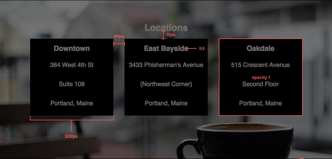
<h2 id="locations">Locations</h2>
<div class="address">
<h3>Downtown</h3>
<p>384 West 4th St</p>
<p>Suite 108</p>
<p>Portland, Maine</p>
</div>
<div class="address">
<h3>East Bayside</h3>
<p>3433 Phisherman's Avenue</p>
<p>(Northwest Corner)</p>
<p>Portland, Maine</p>
</div>
<div class="address">
<h3>Oakdale</h3>
<p>515 Crescent Avenue</p>
<p>Second Floor</p>
<p>Portland, Maine</p>
</div>
</article>
</section>
CSS:
.banner-3 article {
    height: 500px;
    width: 1200px;
    background-image: url("../images/img-locations-background.jpg");
    background-repeat: no-repeat;
    background-position-y: center;
    background-size: cover;
    margin: 0 auto;
    margin-top: 2.5%;
    display: inline-flex;
    justify-content: center;
    align-items: center;
}

.banner-3 .address {
    width: 300px;
    height: 300px;
    display: flex;
    flex-direction: column;
    align-content: center;
    justify-content: center;
    background-color: black;
    opacity: 1;
    margin: 20px;
}

.address h3, p {
    margin: 25px auto;
}
Any help would be appreciated.
Nitheesh
You have to wrap these three elements into a container with display: flex; flex-direction: row. This will make the container display horizontally its contents. Also give the article style as display: flex; flex-direction: column; This will make the h2 align above thode 3 cards.
.banner-3 article {
  height: 500px;
  /* width: 100%; */
  width: 1200px;
  background-image: url("https://www.w3schools.com/howto/photographer.jpg");
  background-repeat: no-repeat;
  background-position-y: center;
  background-size: cover;
  margin: 0 auto;
  margin-top: 2.5%;
  display: inline-flex;
  justify-content: center;
  align-items: center;
}

.banner-3 .address {
  width: 300px;
  height: 300px;
  display: flex;
  flex-direction: column;
  align-content: center;
  justify-content: center;
  background-color: black;
  opacity: 1;
  margin: 20px;
  margin-top: 0;
  color: aliceblue;
}

.address h3,
p {
  margin: 25px auto;
}

.container {
  display: flex;
}

article {
  display: flex;
  flex-direction: column;
}

h2 {
  margin-bottom: 15px;
}
<section class="banner-3">
<article>
<h2 id="locations">Locations</h2>
<div class="container">
<div class="address">
<h3>Downtown</h3>
<p>384 West 4th St</p>
<p>Suite 108</p>
<p>Portland, Maine</p>
</div>
<div class="address">
<h3>East Bayside</h3>
<p>3433 Phisherman's Avenue</p>
<p>(Northwest Corner)</p>
<p>Portland, Maine</p>
</div>
<div class="address">
<h3>Oakdale</h3>
<p>515 Crescent Avenue</p>
<p>Second Floor</p>
<p>Portland, Maine</p>
</div>
</div>
</article>
</section>Collected from the Internet
Please contact [email protected] to delete if infringement.
edited at
- Prev: How to shoot a projectile in the way the player is looking in a TDS
- Next: SVG width and height when inserted in HTML as text
Related
TOP Ranking
- 1
Failed to listen on localhost:8000 (reason: Cannot assign requested address)
- 2
Loopback Error: connect ECONNREFUSED 127.0.0.1:3306 (MAMP)
- 3
How to import an asset in swift using Bundle.main.path() in a react-native native module
- 4
pump.io port in URL
- 5
Compiler error CS0246 (type or namespace not found) on using Ninject in ASP.NET vNext
- 6
BigQuery - concatenate ignoring NULL
- 7
ngClass error (Can't bind ngClass since it isn't a known property of div) in Angular 11.0.3
- 8
ggplotly no applicable method for 'plotly_build' applied to an object of class "NULL" if statements
- 9
Spring Boot JPA PostgreSQL Web App - Internal Authentication Error
- 10
How to remove the extra space from right in a webview?
- 11
java.lang.NullPointerException: Cannot read the array length because "<local3>" is null
- 12
Jquery different data trapped from direct mousedown event and simulation via $(this).trigger('mousedown');
- 13
flutter: dropdown item programmatically unselect problem
- 14
How to use merge windows unallocated space into Ubuntu using GParted?
- 15
Change dd-mm-yyyy date format of dataframe date column to yyyy-mm-dd
- 16
Nuget add packages gives access denied errors
- 17
Svchost high CPU from Microsoft.BingWeather app errors
- 18
Can't pre-populate phone number and message body in SMS link on iPhones when SMS app is not running in the background
- 19
12.04.3--- Dconf Editor won't show com>canonical>unity option
- 20
Any way to remove trailing whitespace *FOR EDITED* lines in Eclipse [for Java]?
- 21
maven-jaxb2-plugin cannot generate classes due to two declarations cause a collision in ObjectFactory class
Comments