Why this 100% width image is bigger than screen width * device pixel ratio
Cesar
I'm sure I'm missing something here.
Why this 100% width image is bigger than window.screen.width * window.devicePixelRatio
If the screen width equals to 360px and the device ratio is 2
Shouldn't this 100% width image equals to 720px instead of the reported 964px
Fixed Width Images
Also if I put a 720px image it does not cover the full device width???
Note that this is on my real device, a moto g4 play with a 720x1280 screen resolution 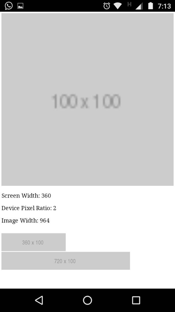
EDIT
When I run this code, the reported width if the image is 964px in my case.
This code is also here http://li209-135.members.linode.com/
It should be viewed in a mobile browser.
<!DOCTYPE html>
<html>
<head>
	<title>Test</title>
	<script type="text/javascript" src="//cdnjs.cloudflare.com/ajax/libs/jquery/3.3.1/jquery.js"></script>
	<script>
		$(function(){
		  $('#log').append('<p style="font-size:2em;">Screen Width: ' + window.screen.width + '</p>');
		  $('#log').append('<p style="font-size:2em;"> Device Pixel Ratio: ' + window.devicePixelRatio + '</p>');
		  $('#log').append('<p style="font-size:2em;"> Image Width: ' + $('#test-image').width() + '</p>');
		});
	</script>
</head>
<body>
	<img id="test-image" width="100%" src="http://via.placeholder.com/100x100">
	<div id="log"></div>
	<br>
	<img id="test-image" width="360px" src="http://via.placeholder.com/360x100">
	<br>
	<img id="test-image" width="720px" src="http://via.placeholder.com/720x100">

</body>
</html>
Kornel
The dimensions are scaled or fake, because mobile browsers emulate desktop browsers for compatibility with non-mobile pages.
By default, pages in mobile browsers are rendered on a 960-pixel wide virtual screen, which is then scaled down to the actual screen size (or zoomed, etc.). This article describes this process in depth: https://www.quirksmode.org/mobile/viewports.html
To have your page dimensions closer to the actual device screen size, you need to add:
<meta name="viewport" content="width=device-width,initial-scale=1">
Collected from the Internet
Please contact [email protected] to delete if infringement.
edited at
Related
TOP Ranking
- 1
Can't pre-populate phone number and message body in SMS link on iPhones when SMS app is not running in the background
- 2
pump.io port in URL
- 3
Failed to listen on localhost:8000 (reason: Cannot assign requested address)
- 4
How to import an asset in swift using Bundle.main.path() in a react-native native module
- 5
How to use HttpClient with ANY ssl cert, no matter how "bad" it is
- 6
Modbus Python Schneider PM5300
- 7
What is the exact difference between “ use_all_dns_ips” and "resolve_canonical_bootstrap_servers_only” in client.dns.lookup options?
- 8
Spring Boot JPA PostgreSQL Web App - Internal Authentication Error
- 9
BigQuery - concatenate ignoring NULL
- 10
split column by delimiter and deleting expanded column
- 11
Unable to use switch toggle for dark mode in material-ui
- 12
Soundcloud API Authentication | NodeWebkit, redirect uri and local file system
- 13
Apache rewrite or susbstitute rule for bugzilla HTTP 301 redirect
- 14
Is there an option for a Simulink Scope to display the layout in single column?
- 15
UWP access denied
- 16
Center buttons and brand in Bootstrap
- 17
express js can't redirect user
- 18
Make a B+ Tree concurrent thread safe
- 19
Printing Int array and String array in one
- 20
Google Chrome Translate Page Does Not Work
- 21
Elasticsearch - How to match number range in string
Comments