CSS linear-gradient with semi-transparent borders
beercohol
I'm using linear-gradients with semi-transparent borders for creating modules and buttons etc. Using (for example) rgba(0,0,0,0.1) as the border colour is convenient, because I can set any background colour on my elements without having to worry about the border colour again.
However I've noticed a very odd effect - when combined with a linear-gradient background, browsers use the height of the element's padding box to calculate the height of the gradient, which means it repeats over the top and bottom margins, creating a very odd effect: 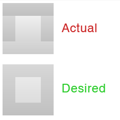
Here is the CSS that generates the "Actual" box:
.box {
    box-sizing: border-box;
    height: 100px;
    width: 100px;
    border: 25px solid rgba(0,0,0,0.1);
    background-color: #eee;
    background-image: linear-gradient(to bottom, rgba(255, 255, 255, 0.1) 0%, rgba(0, 0, 0, 0.1) 100%);
    margin-bottom: 20px;
}
Now I've already found a workaround that allows me to achieve the desired effect, by forcing the background-size to be 100% + the border size. This is what generated the "Desired" box (.box2):
.box2 {
    background-position: 0 center;
    background-size: auto calc(100% + 50px);
}
However that seems a bit hacky.
So my question is: Can anyone explain why this is - I can't find it documented anywhere, and does anyone have a neater solution?
Here's the JS Fiddle that I used to create the examples, and it also includes a box with an actual image background for comparison: http://jsfiddle.net/29rgksgx/4/
vals
You can choose which of the boxes is used as a reference for the background
Choose border-box and it will work as desired
You can choose between border content and padding box
.box {
    box-sizing: border-box;
    height: 100px;
    width: 100px;
    border: 25px solid rgba(0,0,0,0.1);
    background-color: #eee;
    margin-bottom: 20px;
    background-image: linear-gradient(to bottom, rgba(255, 255, 255, 0.1) 0%, rgba(0, 0, 0, 0.1) 100%);
    background-origin: border-box;  /* the trick */
}
<div class="box"></div>Collected from the Internet
Please contact [email protected] to delete if infringement.
edited at
- Prev: How to provide ability to make code review using TortoiseSVN?
- Next: Ruby on Rails - show current date only
Related
TOP Ranking
- 1
Can't pre-populate phone number and message body in SMS link on iPhones when SMS app is not running in the background
- 2
Failed to listen on localhost:8000 (reason: Cannot assign requested address)
- 3
pump.io port in URL
- 4
Loopback Error: connect ECONNREFUSED 127.0.0.1:3306 (MAMP)
- 5
How to import an asset in swift using Bundle.main.path() in a react-native native module
- 6
Spring Boot JPA PostgreSQL Web App - Internal Authentication Error
- 7
3D Touch Peek Swipe Like Mail
- 8
BigQuery - concatenate ignoring NULL
- 9
How to how increase/decrease compared to adjacent cell
- 10
Make a B+ Tree concurrent thread safe
- 11
Emulator wrong screen resolution in Android Studio 1.3
- 12
Can a 32-bit antivirus program protect you from 64-bit threats
- 13
Svchost high CPU from Microsoft.BingWeather app errors
- 14
Double spacing in rmarkdown pdf
- 15
Unable to use switch toggle for dark mode in material-ui
- 16
java.lang.NullPointerException: Cannot read the array length because "<local3>" is null
- 17
Google Chrome Translate Page Does Not Work
- 18
How to fix "pickle_module.load(f, **pickle_load_args) _pickle.UnpicklingError: invalid load key, '<'" using YOLOv3?
- 19
Using Response.Redirect with Friendly URLS in ASP.NET
- 20
Bootstrap 5 Static Modal Still Closes when I Click Outside
- 21
SSIS setting column with data in Script Component
Comments