Swift - 以编程方式将项目的高度设置为与嵌套 UIStackView 中的父项相同
威尔弗雷德
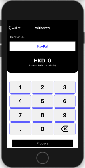
我有一个包含 3 个主要部分的 UI:标题、键盘和按钮。
头部和按钮的大小是固定的,剩余的区域应该被键盘占据。
像这样:

键盘部分由嵌套的 UIStackView(垂直 UIStackView 父级,具有 4 个水平 UIStackView 子级)构建,3 个按钮将添加到每个水平 UIStackView。
一切都很好,除了我希望按钮与水平 UIStackView 具有相同的高度,以便用户单击它应该更容易。
我努力了
rowStackView.alignment = .fill
要么
for button in numberButtons
{
    button.translatesAutoresizingMaskIntoConstraints = false
    button.heightAnchor.constraint(equalTo: button.superview!.heightAnchor).isActive = true
}
但是, numberPadStackView 将被挤压如下。我该如何解决?谢谢。

这些是我现在的代码:
headerStackView.axis = .vertical
headerStackView.alignment = .center
headerStackView.setContentHuggingPriority(.defaultHigh, for: .vertical)
headerStackView.setContentCompressionResistancePriority(.defaultHigh, for: .vertical)
view.addSubview(headerStackView)

numberPadStackView.axis = .vertical
numberPadStackView.distribution = .fillEqually
numberPadStackView.alignment = .center
view.addSubview(numberPadStackView)

initNumpad()

view.addSubview(requestLabel)
initNumPad ()
private func initNumpad()
{
    var rowStackView = UIStackView()

    numberButtons.removeAll()

    for i in 0 ..< 11
    {
        if i % 3 == 0
        {
            rowStackView = UIStackView()
            rowStackView.axis = .horizontal
            rowStackView.distribution = .fillEqually
            rowStackView.alignment = .center
            rowStackView.setContentHuggingPriority(.defaultLow, for: .vertical)
            numberPadRowStackView.append(rowStackView)
            numberPadStackView.addArrangedSubview(rowStackView)
        }

        let button = UIButton()

        switch i
        {
        case 0 ..< 9:
            button.setTitle("\(i + 1)", for: .normal)
        case 9:
            button.setTitle(".", for: .normal)
        case 10:
            button.setTitle("0", for: .normal)
        default:
            return
        }
        button.titleLabel?.textAlignment = .center
        button.setContentHuggingPriority(.defaultLow, for: .vertical)
        button.backgroundColor = UIColor.random()
        numberButtons.append(button)

        rowStackView.addArrangedSubview(button)
    }

    numberPadDeleteImageView.backgroundColor = UIColor.random()
    rowStackView.addArrangedSubview(numberPadDeleteImageView)
}
布局
headerStackView.translatesAutoresizingMaskIntoConstraints = false
numberPadStackView.translatesAutoresizingMaskIntoConstraints = false
requestLabel.translatesAutoresizingMaskIntoConstraints = false

NSLayoutConstraint.activate([
    headerStackView.topAnchor.constraint(equalTo: view.safeAreaLayoutGuide.topAnchor, constant: 24),
    headerStackView.leadingAnchor.constraint(equalTo: view.leadingAnchor, constant: Padding),
    headerStackView.trailingAnchor.constraint(equalTo: view.trailingAnchor, constant: -Padding),

    numberPadStackView.topAnchor.constraint(equalTo: headerStackView.bottomAnchor, constant: 43),
    numberPadStackView.leadingAnchor.constraint(equalTo: view.leadingAnchor, constant: Padding),
    numberPadStackView.trailingAnchor.constraint(equalTo: view.trailingAnchor, constant: -Padding),

    requestLabel.topAnchor.constraint(equalTo: numberPadStackView.bottomAnchor, constant: 21),
    requestLabel.leadingAnchor.constraint(equalTo: view.leadingAnchor, constant: 28),
    requestLabel.trailingAnchor.constraint(equalTo: view.trailingAnchor, constant: -28),
    requestLabel.bottomAnchor.constraint(equalTo: view.safeAreaLayoutGuide.bottomAnchor, constant: -5),
    requestLabel.heightAnchor.constraint(equalToConstant: 40),
])

for rowStackView in numberPadRowStackView
{
    rowStackView.translatesAutoresizingMaskIntoConstraints = false
    rowStackView.widthAnchor.constraint(equalTo: numberPadStackView.widthAnchor).isActive = true
}
唐麦格
Couple notes...
Setting Content Hugging Priority on a UIStackView is generally not going to give you the expected results. That's because the stack view is arranging its subviews (based on the stack view's Alignment and Distribution properties). The Content Hugging Priority of the stack view's arranged subviews will be the controlling factor.
As is obvious, if I lay out 4 labels, vertically constrained top-to-bottom, each having the same Content Hugging priority (such as the default 250), I'll get something like this in Storyboard (note the Red layout-problem indicator):

and at runtime it may look like this:

Auto-layout is going to respect the (intrinsic) Height for Labels 1, 2 and 4, and then stretch Label 3 to complete the layout.
If I embed the top two and bottom two labels each in vertical stack views...
Storyboard will look like this (again, note the Red layout-problem indicator):

and we get the same thing at run-time:

Even if I set the Content Hugging Priority of the top stack view to 1000, it won't make a difference -- because auto-layout is using the arranged subviews to decide what to do.
So, for your layout, divide your screen into *three layout elements:
- the "header" section
- the "numberPad" section
- the "process" section
and then tell auto-layout you want the Header and Process elements to maintain their heights, and allow the numberPad to stretch.
由于 UI 元素默认为 250 的拥抱优先级,可能最简单的管理方法是降低数字键盘按钮的拥抱优先级。
这是一些示例代码。我不确定您如何布置“headerStackView”,因为它看起来并不适合堆栈视图……所以,我将其布置为标题UIView:
class WithNumpadViewController: UIViewController {

    // three "parts" to our layout
    let headerView = UIView()
    let numberPadStackView = UIStackView()
    let requestLabel = UILabel()

    // data labels to be filled-in
    let currencyLabel = UILabel()
    let currValueLabel = UILabel()
    let balanceLabel = UILabel()

    // however you're using this
    var numberButtons: [UIButton] = []

    let Padding: CGFloat = 16

    override func viewDidLoad() {
        super.viewDidLoad()

        if let vc = self.navigationController?.viewControllers.first {
            vc.navigationItem.title = "Wallet"
        }

        self.navigationController?.navigationBar.barTintColor = .black
        self.navigationController?.navigationBar.tintColor = .white
        self.navigationController?.navigationBar.isTranslucent = false
        self.navigationController?.navigationBar.titleTextAttributes = [NSAttributedString.Key.foregroundColor: UIColor.white]

        title = "Withdraw"

        // add "three parts" to view
        [headerView, numberPadStackView, requestLabel].forEach {
            $0.translatesAutoresizingMaskIntoConstraints = false
            view.addSubview($0)
        }

        let g = view.safeAreaLayoutGuide

        NSLayoutConstraint.activate([

            // constrain headerView to Top / Leading / Trailing (safe-area)
            //  let its content determine its height
            headerView.topAnchor.constraint(equalTo: g.topAnchor, constant: 0.0),
            headerView.leadingAnchor.constraint(equalTo: g.leadingAnchor, constant: 0.0),
            headerView.trailingAnchor.constraint(equalTo: g.trailingAnchor, constant: 0.0),

            // constrain numberPad 40-pts from Bottom headerView
            numberPadStackView.topAnchor.constraint(equalTo: headerView.bottomAnchor, constant: 40),
            //  Leading / Trailing with Padding
            numberPadStackView.leadingAnchor.constraint(equalTo: g.leadingAnchor, constant: Padding),
            numberPadStackView.trailingAnchor.constraint(equalTo: g.trailingAnchor, constant: -Padding),

            // constrain requestLabel 21-pts from Bottom of numberPad
            requestLabel.topAnchor.constraint(equalTo: numberPadStackView.bottomAnchor, constant: 21),
            //  Leading / Trailing with 28-pts padding
            requestLabel.leadingAnchor.constraint(equalTo: g.leadingAnchor, constant: 28),
            requestLabel.trailingAnchor.constraint(equalTo: g.trailingAnchor, constant: -28),
            // Bottom 5-pts from Bottom (safe-area)
            requestLabel.bottomAnchor.constraint(equalTo: g.bottomAnchor, constant: -5),
            // explicit Height of 40-pts
            requestLabel.heightAnchor.constraint(equalToConstant: 40),
        ])

        // setup contents of headerView
        initHeader()

        // setup contents of numberPad
        initNumpad()

        // properties for requestLabel
        requestLabel.backgroundColor = .black
        requestLabel.textColor = .white
        requestLabel.textAlignment = .center
        requestLabel.text = "Process"

        // fill-in data labels
        currencyLabel.text = "HKD"
        currValueLabel.text = "0"
        balanceLabel.text = "Balance: HKD 2 (Available)"

        // maybe add number pad button actions here?
        numberButtons.forEach { b in
            b.addTarget(self, action: #selector(self.numberPadButtonTapped(_:)), for: .touchUpInside)
        }
    }

    @objc func numberPadButtonTapped(_ btn: UIButton) -> Void {
        let t = btn.currentTitle ?? "Delete"
        print("Tapped:", t)
        // do what you want based on which button was tapped
    }

    private func initHeader()
    {
        // not clear how you're setting up your "header"
        // so I'll guess at it

        // view properties
        headerView.backgroundColor = .black
        headerView.clipsToBounds = true
        headerView.layer.cornerRadius = 24
        headerView.layer.maskedCorners = [.layerMinXMaxYCorner, .layerMaxXMaxYCorner]

        // static text label
        let transferToLabel = UILabel()
        transferToLabel.text = "Transfer to..."
        transferToLabel.font = UIFont.systemFont(ofSize: 14.0, weight: .regular)

        // PayPal button
        let payPalButton = UIButton()
        payPalButton.setTitle("PayPal", for: [])
        payPalButton.backgroundColor = .white
        payPalButton.setTitleColor(.blue, for: [])

        // data label fonts
        currencyLabel.font = UIFont.systemFont(ofSize: 28.0, weight: .bold)
        currValueLabel.font = currencyLabel.font
        balanceLabel.font = UIFont.systemFont(ofSize: 11.0, weight: .regular)

        // label text color
        [transferToLabel, currencyLabel, currValueLabel, balanceLabel].forEach {
            $0.textColor = .white
        }

        // horizontal stack to hold currencyLabel, currValueLabel
        let currValStack = UIStackView()
        currValStack.axis = .horizontal
        currValStack.spacing = 12

        // vertical stack to hold currValStack, balanceLabel
        let innerVStack = UIStackView()
        innerVStack.axis = .vertical
        innerVStack.alignment = .center
        innerVStack.spacing = 2

        // add labels to Horizontal stack
        currValStack.addArrangedSubview(currencyLabel)
        currValStack.addArrangedSubview(currValueLabel)

        // add horizontal stack and balanceLabel to vertical stack
        innerVStack.addArrangedSubview(currValStack)
        innerVStack.addArrangedSubview(balanceLabel)

        // view to hold vertical stack (so we can center it vertically)
        let innerView = UIView()

        // add vertical stack to innerView
        innerView.addSubview(innerVStack)

        // add elements to headerView
        headerView.addSubview(transferToLabel)
        headerView.addSubview(payPalButton)
        headerView.addSubview(innerView)

        // we'll be applying constraints
        [headerView, transferToLabel, payPalButton, currencyLabel, currValueLabel, balanceLabel,
         innerView, innerVStack].forEach {
            $0.translatesAutoresizingMaskIntoConstraints = false
        }

        NSLayoutConstraint.activate([

            // "Transfer to..." label Top: Padding, leading: Padding
            transferToLabel.topAnchor.constraint(equalTo: headerView.topAnchor, constant: Padding),
            transferToLabel.leadingAnchor.constraint(equalTo: headerView.leadingAnchor, constant: Padding),

            // payPal button Top: Padding to transfer label Bottom
            // Leading / Trailing to Leading / Trailing with Padding
            payPalButton.topAnchor.constraint(equalTo: transferToLabel.bottomAnchor, constant: Padding),
            payPalButton.leadingAnchor.constraint(equalTo: headerView.leadingAnchor, constant: Padding),
            payPalButton.trailingAnchor.constraint(equalTo: headerView.trailingAnchor, constant: -Padding),

            // payPalButton explicit height
            payPalButton.heightAnchor.constraint(equalToConstant: 50.0),

            // innerView Top: 0 to payPal button Bottom
            // Leading / Trailing to Leading / Trailing with Padding
            // Bottom: 0
            innerView.topAnchor.constraint(equalTo: payPalButton.bottomAnchor, constant: 0.0),
            innerView.leadingAnchor.constraint(equalTo: headerView.leadingAnchor, constant: Padding),
            innerView.trailingAnchor.constraint(equalTo: headerView.trailingAnchor, constant: -Padding),
            innerView.bottomAnchor.constraint(equalTo: headerView.bottomAnchor, constant: 0.0),

            // innerVStack Top / Bottom to innerView Top / Bottom with 24-pts padding
            // centerX
            innerVStack.topAnchor.constraint(equalTo: innerView.topAnchor, constant: 32.0),
            innerVStack.bottomAnchor.constraint(equalTo: innerView.bottomAnchor, constant: -32.0),
            innerVStack.centerXAnchor.constraint(equalTo: innerView.centerXAnchor, constant: 0.0),

        ])

    }


    private func initNumpad()
    {

        numberButtons.removeAll()

        // numberPad stack properties
        numberPadStackView.axis = .vertical
        numberPadStackView.alignment = .fill
        numberPadStackView.distribution = .fillEqually
        numberPadStackView.spacing = 4

        // a little more logical way to manage button layout
        let buttonLabels: [[String]] = [
            ["1", "2", "3"],
            ["4", "5", "6"],
            ["7", "8", "9"],
            [".", "0", "<"],
        ]

        // adjust as desired
        let btnFontSize: CGFloat = 28

        buttonLabels.forEach { thisRowLabels in
            // create a "row" stack view
            let rowStack = UIStackView()
            rowStack.axis = .horizontal
            rowStack.alignment = .fill
            rowStack.distribution = .fillEqually
            // same horizontal spacing as "number pad" stack's vertical spacing
            rowStack.spacing = numberPadStackView.spacing

            // for each number string
            thisRowLabels.forEach { s in
                // create button
                let btn = UIButton()

                if s == "<" {
                    // if it's the "delete button"
                    // set image here
                    let iconCfg = UIImage.SymbolConfiguration(pointSize: btnFontSize, weight: .bold, scale: .large)
                    if let normIcon = UIImage(systemName: "delete.left", withConfiguration: iconCfg)?.withTintColor(.black, renderingMode: .alwaysOriginal),
                        let highIcon = UIImage(systemName: "delete.left", withConfiguration: iconCfg)?.withTintColor(.lightGray, renderingMode: .alwaysOriginal)
                    {
                        btn.setImage(normIcon, for: .normal)
                        btn.setImage(highIcon, for: .highlighted)
                    }
                } else {
                    // set number pad button title
                    btn.setTitle(s, for: [])
                }

                // number pad button properties
                btn.backgroundColor = UIColor(white: 0.95, alpha: 1.0)
                btn.setTitleColor(.black, for: .normal)
                btn.setTitleColor(.lightGray, for: .highlighted)
                btn.titleLabel?.font = UIFont.systemFont(ofSize: btnFontSize, weight: .bold)

                // let's give 'em a rounded-corner border
                btn.layer.borderColor = UIColor.blue.cgColor
                btn.layer.borderWidth = 1
                btn.layer.cornerRadius = 8

                // allow buttons to stretch vertically!!!
                btn.setContentHuggingPriority(UILayoutPriority(rawValue: 249), for: .vertical)

                // add button to this row stack
                rowStack.addArrangedSubview(btn)

                // add button to numberButtons array
                numberButtons.append(btn)
            }
            // add this rowStack to the number pad stack
            numberPadStackView.addArrangedSubview(rowStack)
        }

    }
}
结果,在 iPhone 8 上:
iPhone 11:

和 iPhone 11 Pro Max:

本文收集自互联网,转载请注明来源。
如有侵权,请联系 [email protected] 删除。
编辑于
相关文章
TOP 榜单
- 1
蓝屏死机没有修复解决方案
- 2
计算数据帧中每行的NA
- 3
UITableView的项目向下滚动后更改颜色,然后快速备份
- 4
Node.js中未捕获的异常错误,发生调用
- 5
在 Python 2.7 中。如何从文件中读取特定文本并分配给变量
- 6
Linux的官方Adobe Flash存储库是否已过时?
- 7
验证REST API参数
- 8
ggplot:对齐多个分面图-所有大小不同的分面
- 9
Mac OS X更新后的GRUB 2问题
- 10
通过 Git 在运行 Jenkins 作业时获取 ClassNotFoundException
- 11
带有错误“ where”条件的查询如何返回结果?
- 12
用日期数据透视表和日期顺序查询
- 13
VB.net将2条特定行导出到DataGridView
- 14
如何从视图一次更新多行(ASP.NET - Core)
- 15
Java Eclipse中的错误13,如何解决?
- 16
尝试反复更改屏幕上按钮的位置 - kotlin android studio
- 17
离子动态工具栏背景色
- 18
应用发明者仅从列表中选择一个随机项一次
- 19
当我尝试下载 StanfordNLP en 模型时,出现错误
- 20
python中的boto3文件上传
- 21
在同一Pushwoosh应用程序上Pushwoosh多个捆绑ID
我来说两句